Data Visualization is one of the key tasks of a data analyst. In this article, we will discuss a component of data visualization called chart junk. We will discuss what chart junk is and how to avoid it using an example.
What is Chart Junk?
Chart junk is any visual element in a chart that is redundant and is not adding any extra information. The chart junk may also confuse and distract the viewer instead of making the visualization more comprehensible.
We can display any information using a minimum set of visual elements and markings in a comprehensible manner. Any visual element apart from the minimum elements required to understandably communicate any information through the chart or graph can be called chart junk.
Chart Junk Example
Examples of Chart junk might include unnecessary background images, background colors, 3-d effects, bold labels, redundant labels, borders, and shadows. To understand this consider the following image.
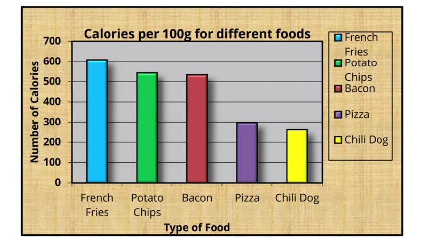
This chart represents data about calories per 100 grams of five fruits. The same information can be conveyed by the following chart. Now,
- The background color of the bar chart adds no value to the chart.
- The gray background of the bar chart provides no information about the data.
- Legends add no extra information to the chart.
- Labels on the x and y axis are of no use as the heading of the chart itself specifies what the chart is all about.
- Borders in the image also don’t provide any information.
- The colors given to the bars provide no information.
- 3-D effects in the bars provide no information.
- Shadow effects in the bars provide no information.
- There are grids present in the chart. Grids can be valuable to explain data points. However, these are useless and add no value to the chart in our case. For instance, You cannot exactly determine the calories per 100 grams for potato chips or Chili dogs using the grids.
- Bold labels add no value. Hence, we will lighten the labels.
After removing all the elements that add no value to the bar chart and adding explicit labels to the bars, we get the following chart.
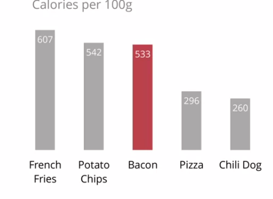
You can observe that we have removed many elements from the chart. Yet, we are able to clearly display the required information. Hence, the removed elements are chart junk.
Why Chart Junk Appears in a Data Visualization?
You can easily fall into the trap of adding chart junk to your visualization to increase embellishment in the chart. You might think that adding an element increases the information that is being passed to the viewer. However, this might not be the actual case. The unnecessary elements can make the visualization cluttered. This will lead to confusion and a decrease in understanding of the chart among the viewers.
- A section of the audience may like embellishments in the visualization while another section might be comfortable with a simple chart.
- A section of the audience might be comfortable with abstraction while another section of the audience might like figuration.
- An audience consisting of researchers and statisticians might like a dense visualization with a lot of information while an audience from an art college might like lightness in the chart.
To understand how you can select elements in your graph to represent the data in a better manner, you can read this article on the data visualization wheel by Alberto Cairo. From the article, you can understand that the visualization should cater to the needs of the viewers.
We can take different measures to avoid or reduce chart junk in our visualization. This has been discussed below. You can also read this article on data ink ratio to understand how we can remove redundant visual elements from a data visualization.
How to Avoid Chart Junk?
There are different ways in which you can minimize chart junk in your visualization. It completely depends on the audience that has to grasp information from the graph.
- The first step in order to avoid chart junk in your visualization is to know your audience. When you create the visualization, make sure that the viewers can easily understand the information being presented. For instance, the chart in a fashion magazine will be entirely different from a chart on the same information in a marketing research journal. So, the viewers and their ability to grasp the shared information matter a lot to decide if an element is chart junk or not.
- While creating the chart, we should be clear about the message we are trying to convey using the chart. The chart should help understand the information being shared.
- How and for what purpose the chart is being displayed is also important to avoid chart junk. If you are presenting the visualization to a live audience, a dense visualization might not be suitable because the time for which the chart is displayed will be low. Hence, even if the elements in the chart are not redundant, they will create confusion among the viewers. So, you need to present a light visualization. On the other hand, you can show a dense visualization in a print medium like a book because the viewer has the time to look at and understand the information being presented in the chart.
- Captions and labels help the viewers understand the information. If it isn’t obvious what the image is about, you should use caption and axis labels to make the information clear.
- Colors can be used to highlight an element in the visualization. You should use colors sparingly. Use it only when you need to specifically highlight as we did in the example above to highlight calories per 100 grams of Bacon.
- Make sure that the data presented in your visualizations is objective. The presented chart and scales should coincide with the captions and labels.
- Lastly, all the non-data elements are not chart-junk. Many elements are necessary to make the visualizations more understandable. Hence, you should analyze the visualization
Conclusion
In this article, we have discussed chart junk and ways to reduce it in your visualization. To learn more about data analysis, you can read this article on data cleaning. You might also like this article on data analyst vs data scientist.
To read about other computer science topics, you can read this article on dynamic role-based authorization using ASP.net. You can also read this article on user activity logging using Asp.net.
Disclosure of Material Connection: Some of the links in the post above are “affiliate links.” This means if you click on the link and purchase the item, I will receive an affiliate commission. Regardless, I only recommend products or services I use personally and believe will add value to my readers.
